Noi Restaurant
A playful restaurant brand identity built around custom illustration, distinctive symbols and a flexible visual system for menus, packaging and digital experiences.
Category:
Branding / Visual Identity
Location:
Petersham | Sydney

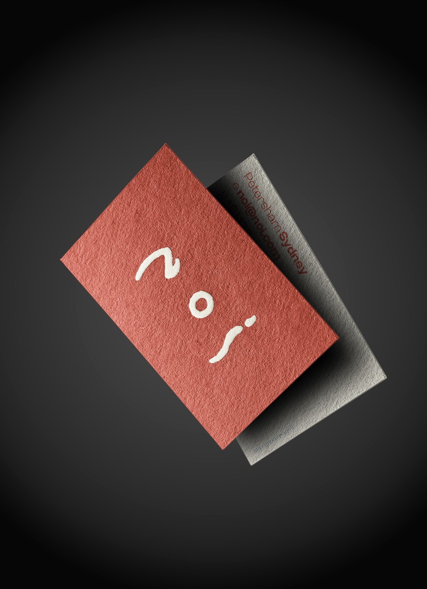


An identity built to evolve.
Rather than relying on a single visual style, the identity embraces variety. Different illustration techniques and a flexible colour system create a brand that feels as dynamic, layered and unexpected as the food itself.

From ingredients to symbols.
The identity begins with three key ingredients: a fish, a beetroot and a carrot. Their forms were distilled into a set of versatile illustrations that naturally shaped the letters N, O and I, turning everyday ingredients into memorable brand assets.


A system, not a style.
Designed to work across menus, packaging, signage and digital touchpoints, the identity is intentionally open-ended. A flexible visual language allows the brand to grow, adapt and remain recognisable without ever feeling repetitive.


